Casino Style: Pastel Suits, Tonal Ties and the Gold Watch
The short answer: pastel takes the room before you open your mouth, a tie one shade deeper than the shirt makes the colour look deliberate instead of loud, and a gold watch worn slightly proud of the cuff is the one piece of jewellery a man can wear without explaining himself. Ace Rothstein does all three at once, which is why a wardrobe that should look ridiculous reads as control.
Martin Scorsese's 1995 film puts Robert De Niro in more than fifty suits, costumed by Rita Ryack, in salmon, mint, butter yellow, powder blue and every pastel in between, each one built with its tie, its pocket square and its glasses as a single unit. The character runs a casino on arithmetic. The clothes are arithmetic too — nothing in them is left to chance, and that is the whole point of studying them.
Pastel is a claim, not a decoration
Grey says nothing in a loud room. That is not a criticism of grey; it is what grey is for. In an office, a courtroom or a funeral, saying nothing is exactly right. On a casino floor at midnight, under warm light, surrounded by people dressed to be looked at, grey disappears.
Pastel does the opposite. A soft colour at full saturation reads from across a room and holds its shape under artificial light, where a dark suit turns into a silhouette. The film uses this literally: Ace is always the most visible man on the floor, and being visible is his job.
What actually makes a pastel suit work:
- Keep the colour muted and dusty rather than bright. Powder blue, not electric blue. Salmon, not coral.
- Choose a cloth with texture. A matte hopsack or a fresco holds pastel beautifully; a shiny worsted in the same colour looks like costume.
- Cut it close and clean. Loud colour plus loose fit is the combination that goes wrong, every time.
- Wear it in daylight or warm light. Pastel under cold fluorescent light goes chalky.

A tonal tie deepens the colour instead of fighting it
The instinct with a coloured shirt or suit is to break it up with a contrasting tie. It rarely works. Two strong colours in the same eyeline compete, and the eye stops at the collision instead of travelling down the outfit.
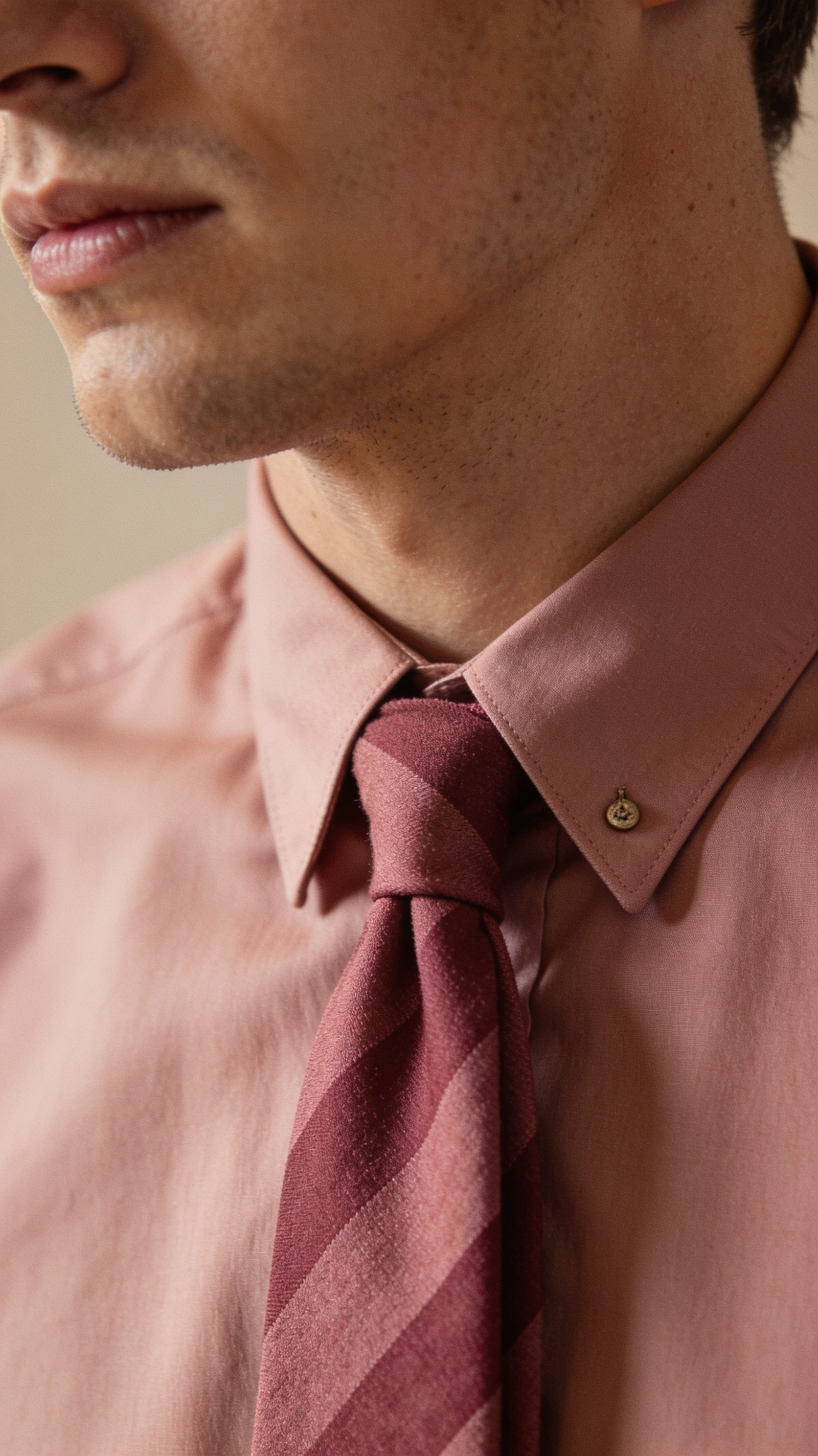
The tonal approach does the opposite. Take the shirt colour and go one or two shades deeper in the tie, and the whole upper body reads as a single deliberate block of colour with depth in it. A pale pink shirt with a dusty rose tie. A cream shirt with a wheat tie. It looks expensive because it looks chosen.
The rules are short:
- Same family, deeper value. If you can name both colours with the same word, you are close.
- Vary the texture instead of the colour. A knitted or grenadine tie against a smooth poplin shirt gives the contrast your eye wants without a colour fight.
- Keep the knot small. Tonal outfits live on line, and a fat knot interrupts it.
- One pattern at most across shirt and tie, and keep its scale small.
The gold watch is the whole accessory budget
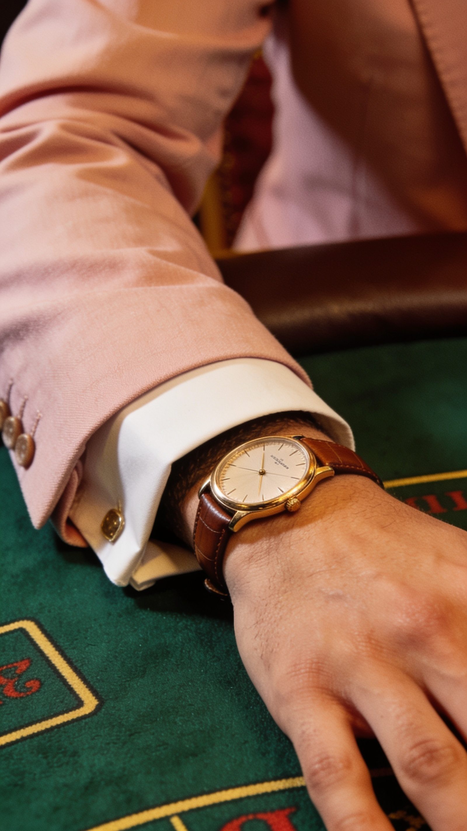
Ace wears gold on the wrist and very little else, and that restraint is what makes it work. A single metal object against a coloured cuff is a punctuation mark. Three of them — watch, bracelet, ring, chain — is a sentence nobody asked to hear.
There is also a practical reason the watch reads so strongly on screen. It sits at the end of the arm, which is the part of the body that moves most, so it catches light every time the hand does anything. That is why dealers, players and anyone whose hands are their work have always worn visible watches.
How to wear one without looking like you are advertising it:
- The cuff should end at the wrist bone, with the watch just visible underneath it as the arm moves.
- Match your metals. Gold watch with gold-toned buckles and cufflinks, or steel with steel.
- Keep the case modest. A period-correct dress watch is 34 to 38mm, and it sits under a cuff instead of fighting it.
- Wear it on a bracelet or a leather strap in a colour already in the outfit. A bright strap makes it a gadget.
Precision is the point, not the colour
It would be easy to read this wardrobe as excess. Fifty suits in sweet colours, gold everywhere, tinted glasses. But look at what is holding it together: every outfit is one colour family, one metal, one level of sheen, one silhouette. The discipline underneath is stricter than a rack of navy suits, because a navy suit forgives mistakes and a salmon suit does not.
That is the transferable lesson, and you do not need a pastel suit to use it. Pick one colour idea, run it through the shirt and tie, keep the metals consistent, and stop there. The outfit will read as considered for exactly the same reason Ace's does.
If you want one piece from this film that works on an ordinary Tuesday, make it the tonal tie. It costs the least, goes with clothes you already own, and is the detail people cannot name but always register.
Frequently asked
Can you still wear a pastel suit?
Yes, in summer, in a muted shade and a textured cloth. Treat it as a warm-weather and daytime outfit, and keep the shirt and tie quiet so the suit is the only statement.
What is a tonal tie?
A tie in the same colour family as the shirt but one or two shades deeper. It reads as one considered block of colour rather than two colours competing at the collar.
Should the watch go over or under the cuff?
Under. The cuff should end at the wrist bone and the watch should appear as the arm moves. A watch worn on top of the cuff is a trick from photo shoots, not from life.
Is a gold watch too flashy for an office?
Not if it is the only jewellery and the case is modest. Flash comes from quantity and size, not from the metal.
What shoes work with a pastel suit?
Mid or dark brown loafers in a matte leather or suede. Black is too hard a contrast and pulls all the attention to the floor.